


We have written about this dashboard before in The Maverick Observer. Why can’t our El Paso County COVID-19 reporting dashboard look like the Lubbock County, Texas reporting dashboard?
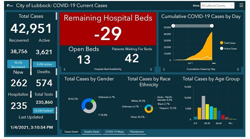
Why is our dashboard 15 pages long? Why can’t we create a snapshot on one page with all the pertinent information highlighted on the main page?
We have posed this question to the El Paso County Commissioners, Colorado Springs City Council, Mayor and Governor. We are still waiting for an answer.
I sent an email to the Public Health Information Officer on November 25, 2020, asking the following questions and have not received an answer back:
- If you stay with the current analysis, have you considered making the font larger and easier to read?
- Slide 2 – are we down 2% in 14-day incidence or up? Helpful to have arrows indicating direction we are heading.
- Slide 3 – how many incidences since 1 Mar 2020?
- Slide 4 – do we show the type of test taken and is the false/positive rate of each factored into the positivity rate? Just like on polls, you have an error/margin you factor into the data provided.
- Slide 5 – Hospital Capacity – does this slide identify out of county patients in our local hospitals?
- Slide 6 – does the death slide indicate deaths with comorbidity and COVID-19 or are they all COVID-19 deaths? Is there a monetary incentive for hospitals and doctors to rule death by COVID-19?
- Slide 7 – Instead of having the hospitals determine their current status, could we get the number of ICU beds vs. Floor beds and their current occupancy numbers? Did the hospitals sign a non-disclosure agreement with each other to not provide bed information?
- Slide 8 – if I query the dates 11/9-11/23, your pie chart indicates 28 outbreaks in different setting types, but your chart below states 31 outbreaks with 163 confirmed cases. Wouldn’t it be better to have another pie chart that breaks down the confirmed cases by setting type, i.e. Personal Services has a 1 to indicate one personal service business had an outbreak, but if that one business accounted for 50 confirmed cases out of 163, wouldn’t that indicate a bigger problem in that business?
- Slide 9 – if you take cases – (deaths + recovered + active) = 0. Why does the number equal 360 identified cases?
- Slide 10 – provides locations with numbers, but without any analysis from contact tracing. I live in 80906 and it has the highest number of cases, why?
- Slide 11 – Unfortunately having such a large population of “Other” does not answer support the theory that minorities are more likely to get COVID and die from it because of a lack of adequate healthcare.
Why do we have to make it so hard to get great information out of our public health officials?


